


Turn audio into notes
Record as you go—Uplearn turns speech into structured notes you can edit and reuse.
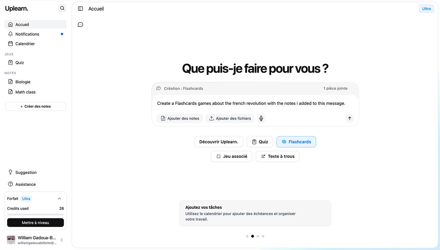
Generate and generate notes, flashcards, quiz and study games in seconds with AI
Record as you go—Uplearn turns speech into structured notes you can edit and reuse.
Ask about a note, quiz, or topic—Uplearn explains it clearly so you can keep moving.
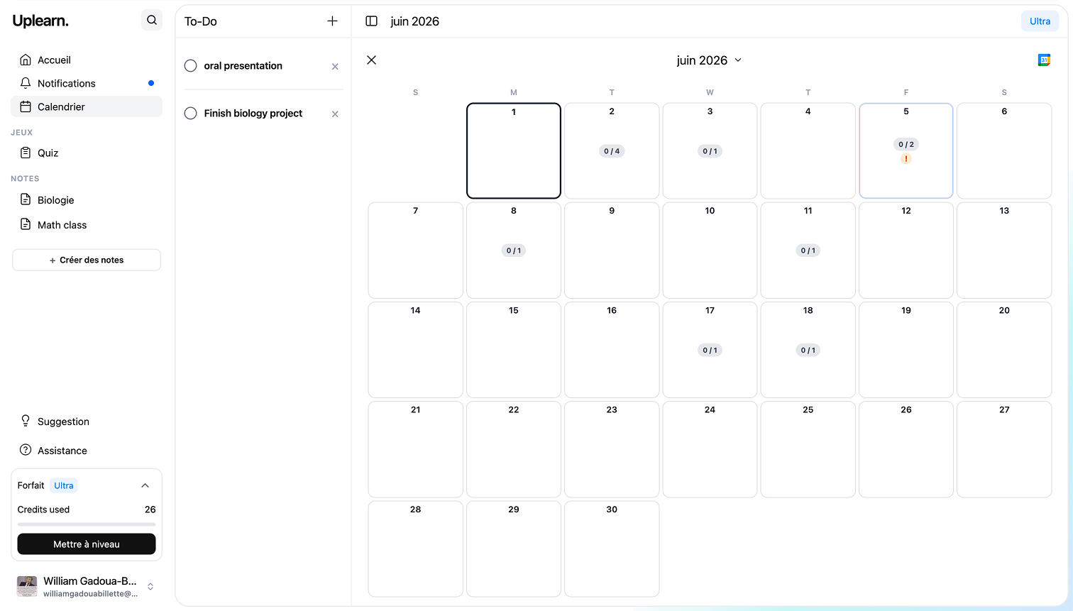
Classes, deadlines, and study blocks in one calendar—see what’s due and plan your week.
Capture a lecture or study session with your mic—Uplearn listens while you stay focused on class.
AI turns your recording into clear, structured notes with headings, lists, and highlights—ready to review.
Skim, edit, and reuse your notes for flashcards, quizzes, and revision—without rebuilding everything by hand.
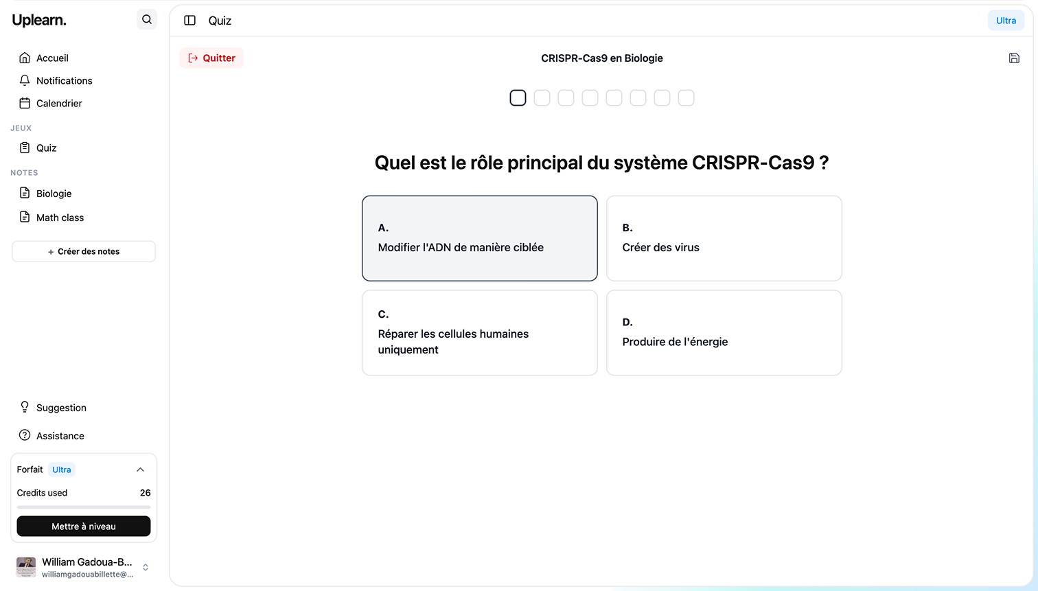
Quizzes, flashcards, matching games, and mixed tests—generated from your lectures and notes in seconds. Practice with material you actually covered, not generic question banks.
Millions of builders are already turning their classes and notes into quiz, flashcards, associates games and more.